General
@May 1, 2022 8:48 PM (GMT+8) Honestly, actually pretty happy to be able to type and write my thoughts out as it comes in this journal / research page of sorts. Much to learn about from writing and thinking through ones thoughts, yes?
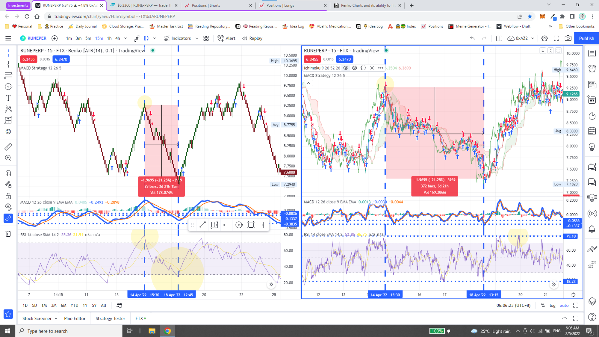
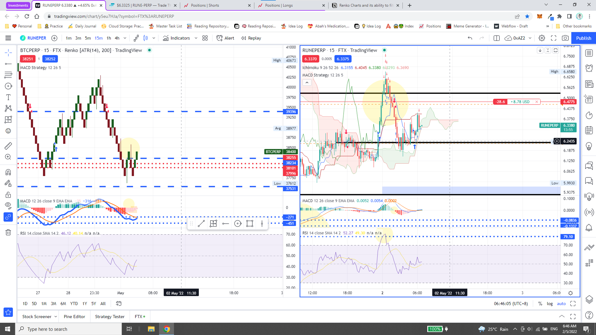
Anyhow, at that — very interesting. Recently managed to get a free trial (of sorts) for TradingView Pro+ and am amazed at my ability to use these other charts to review my positions.
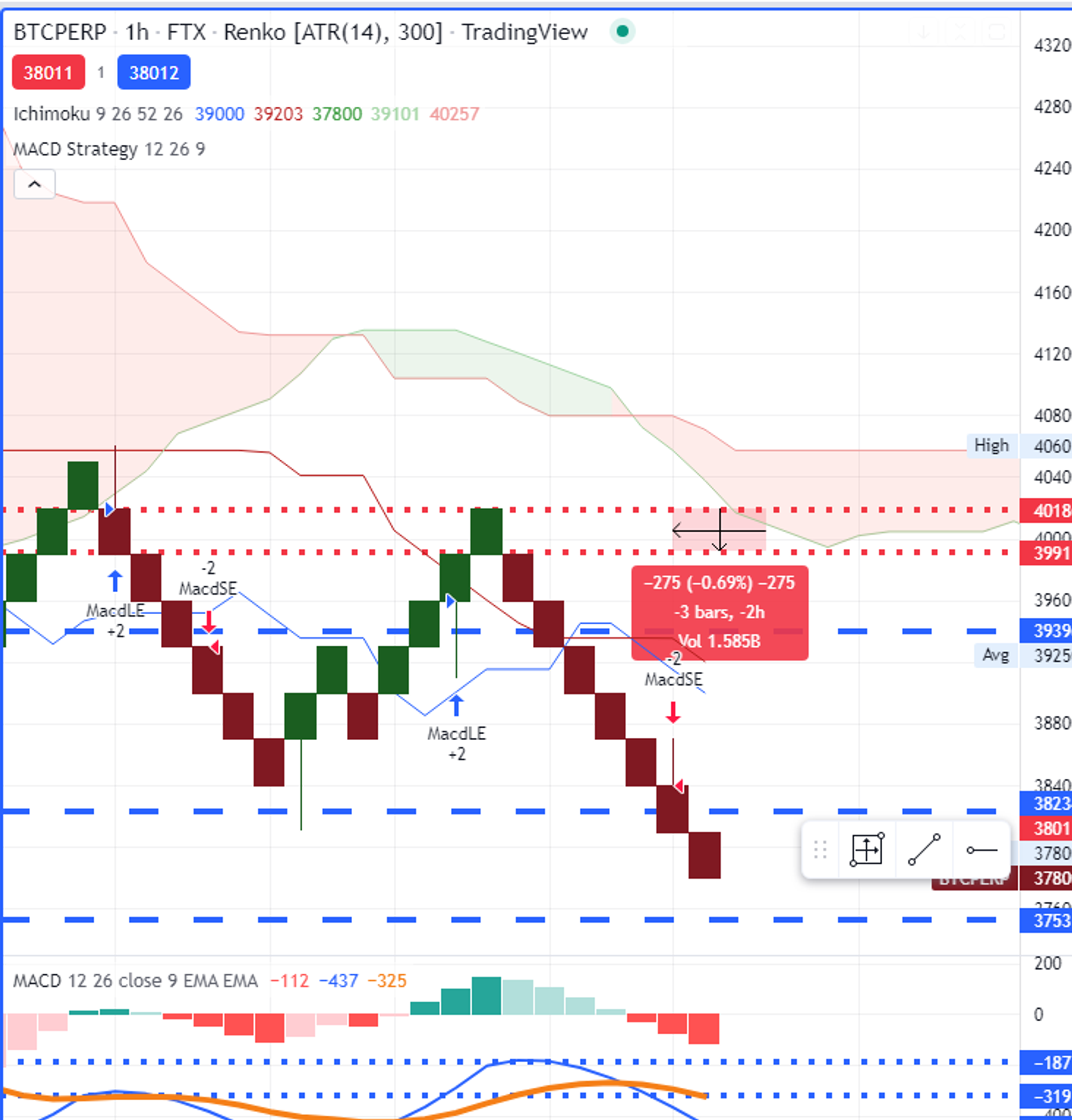
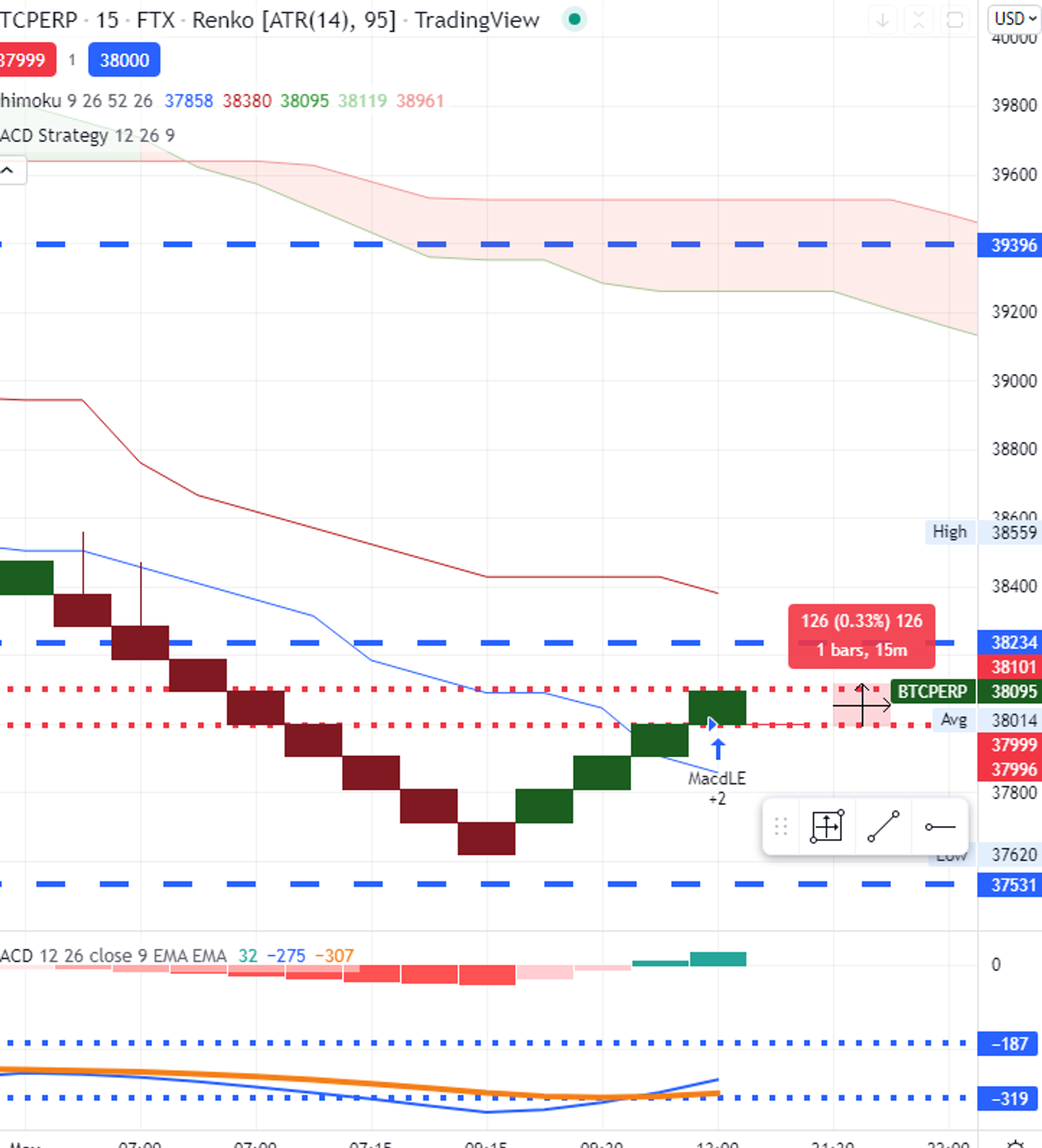
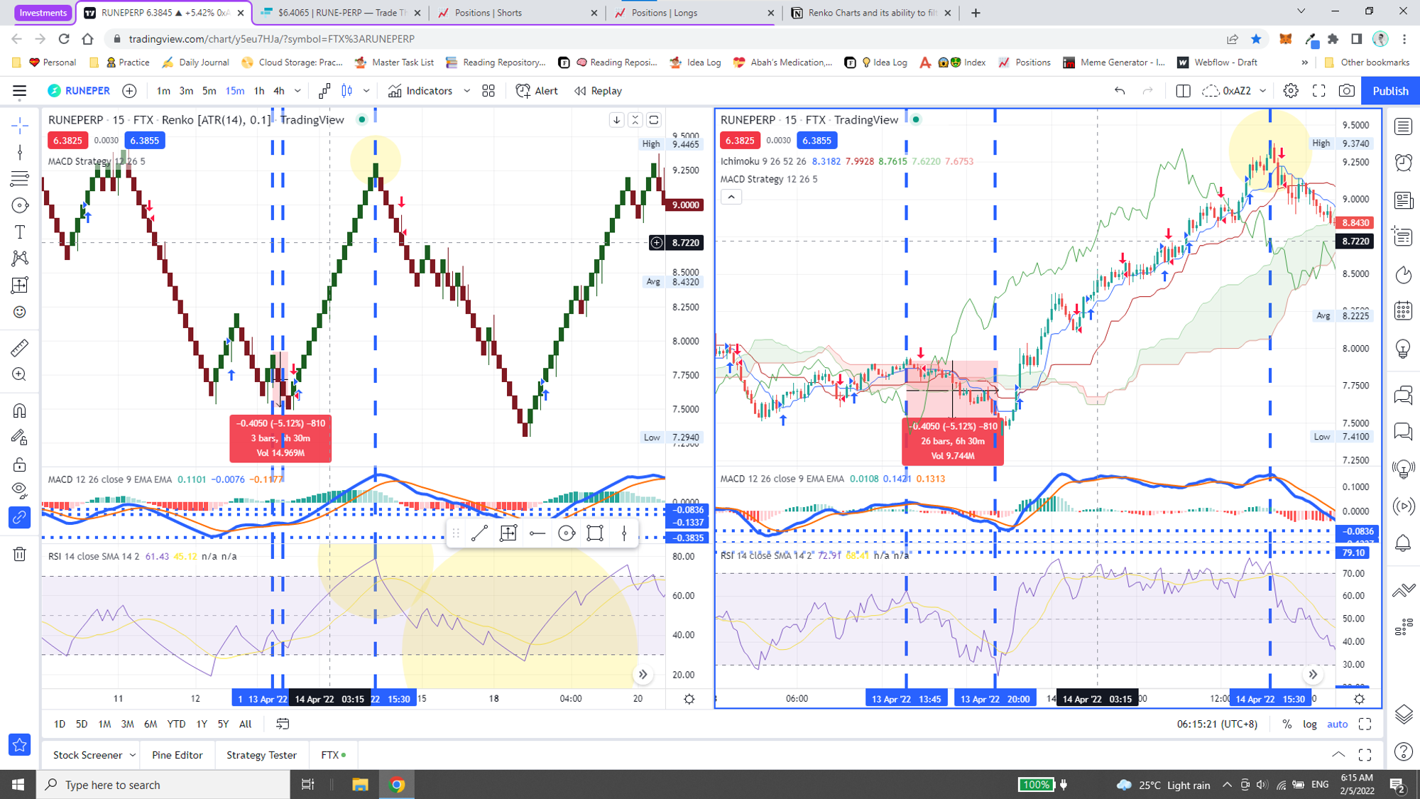
One of which is this new chart called “Renko”. Pretty interesting, that it filters out most noise and only shows clear trends and momentum!
/activetrading11-5bfc2b9b46e0fb00265bedaf.jpg)
Renko charts are effective in identifying support and resistance levels since there is a lot less noise than a candlestick chart. When a strong trend forms, Renko traders may be able to ride that trend for a long time before even one brick in the opposite direction forms.
But at that, it does require me to go into far “smaller” timeframes. But to note! Timeframes are not a consideration for Renko charts. So yes. Definitely a good way to review momentum man.
Increasing or decreasing the box size will affect the "smoothness" of the chart. Decreasing the box size will create more swings, but will also highlight possible price reversals earlier. A larger box size will reduce the number of swings and noise but will be slower to signal a price reversal.
Additionally, with the use of a MACD indicator and the MACD Histogram especially, I can “safely” attempt to speculate on the direction that which the asset is moving.
But then again, this is Crypto, so everything with a grain of salt.
In the case of the MACD Histogram, when the momentum starts to taper, that is very likely the opportunity for a reverse position.
Timing
At that, with the consideration that smaller boxes are a better way of recognising shifts in momentum, what is the value of larger boxes / timeframes / percentages then?
Yes, percentages — after a review (of sorts), realised that the boxes are significantly larger at different “timeframes” which equates to larger percentages too.
Verifying the Probability
Narrative
Keywords | |||
1 | Renko | Green
Turning Green
Red
Turning Red | |
2 | MACD Strategy | Up
Down | |
3.1 | MACD Indicator | Histogram | Green
Light Green
Red
Light Red |
3.2 | MACD Indicator | MACD Line | Up
Moving Up
Down
Moving Down |
BTC | RUNE | |||
1 | Renko | Green
Turning Green
Red
Turning Red | Green
Turning Green
Red
Turning Red | |
2 | MACD Strategy | Up
Down | Up
Down | |
3.1 | MACD Indicator | Histogram | Green
Light Green
Red
Light Red | Green
Light Green
Red
Light Red |
3.2 | MACD Indicator | MACD Line | Up
Moving Up
Down
Moving Down | Up
Moving Up
Down
Moving Down |
Templates
📈 | 🟢 Entry | 🟢 6.29 | 🔴 Exit | 🔴 |
BTC | RUNE | |||
1 | Renko | Red | Green | |
2 | MACD Strategy | Up | Up | |
3.1 | MACD Indicator | Histogram | Green | Green |
3.2 | MACD Indicator | MACD Line | Up | Up |
4 | RSI | Up | Up |
Time | BTC | RUNE |
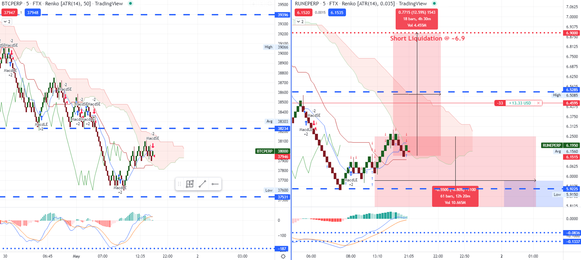
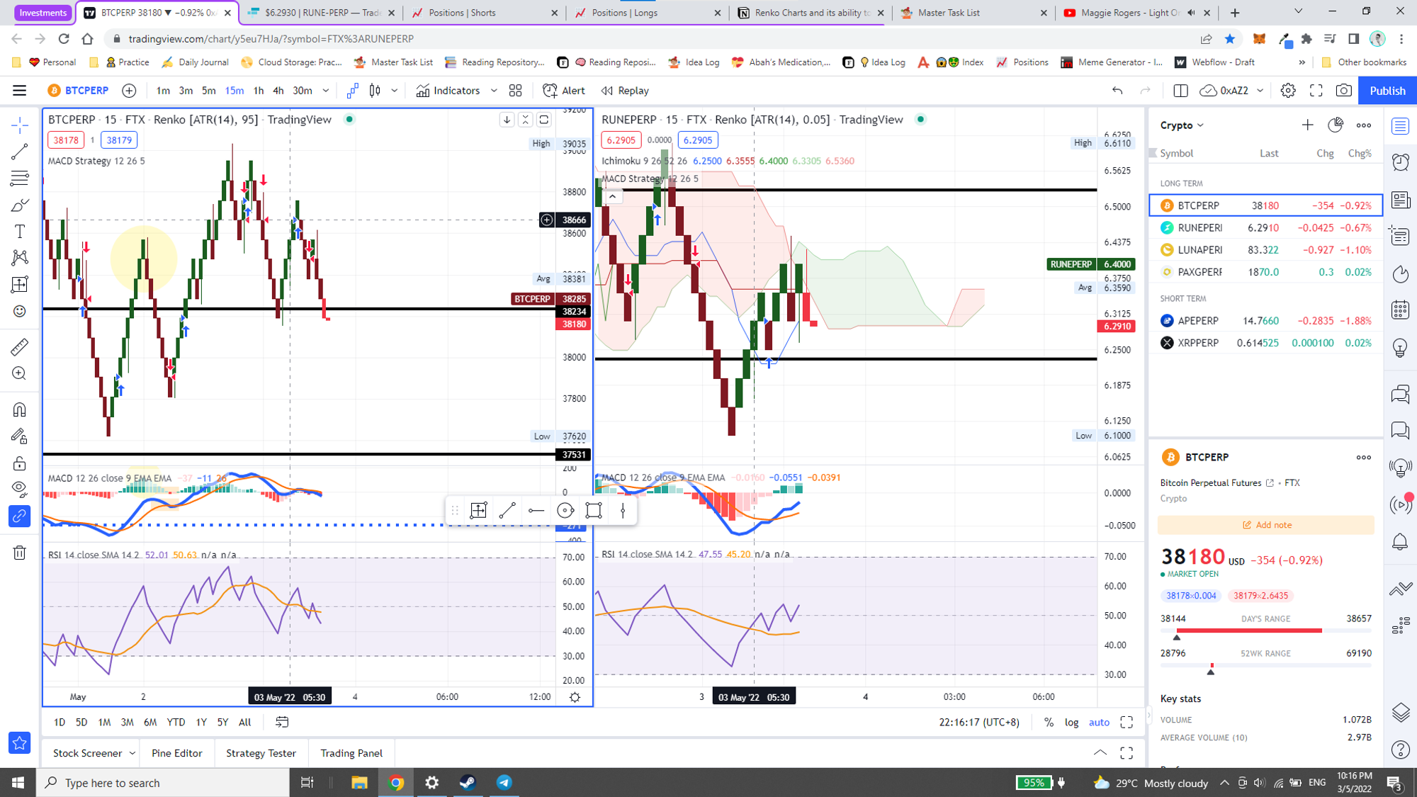
10:16 PM | ~38,180 | ~6.29 |
Probability Validity |
🟢 |
- Closing Positions:
- Short Closed
- Long Closed
- Broken Supports and Resistances
- Broken Support
- Broken Resistance
- Renko Reversals
- Possible Renko Reversal 📈/📉
- Renko Reversal
- +1 / +2
- -1 / -2
Precedent
Honestly feel this is a prime example. But also making me rethink some of the strategies I have in place.
Using the RSI indicator as a more powerful indicator — easily for “overbought” and “oversold” conditions.
Live
Archived
5 Minutes
BTC | RUNE | |||
1 | Renko | Turning Red | Turning Red | |
2 | MACD Strategy | |||
3.1 | MACD Indicator | Histogram | Light Green | Light Green |
3.2 | MACD Indicator | MACD Line | Moving Down | Moving Down |
15 Minutes
BTC | RUNE | |||
1 | Renko | Green | Green | |
2 | MACD Strategy | Up | ||
3.1 | MACD Indicator | Histogram | Green | Light Red |
3.2 | MACD Indicator | MACD Line | Up | Moving Up |
@May 2, 2022
5 Minutes 🐻
📉 | Entry | 6.33 | Exit | |
BTC | RUNE | |||
1 | Renko | Red | Green | |
2 | MACD Strategy | Up | Down | |
3.1 | MACD Indicator | Histogram | Light Green | Light Red |
3.2 | MACD Indicator | MACD Line | Moving Down | Moving Up |
4 | RSI | Down | Up |
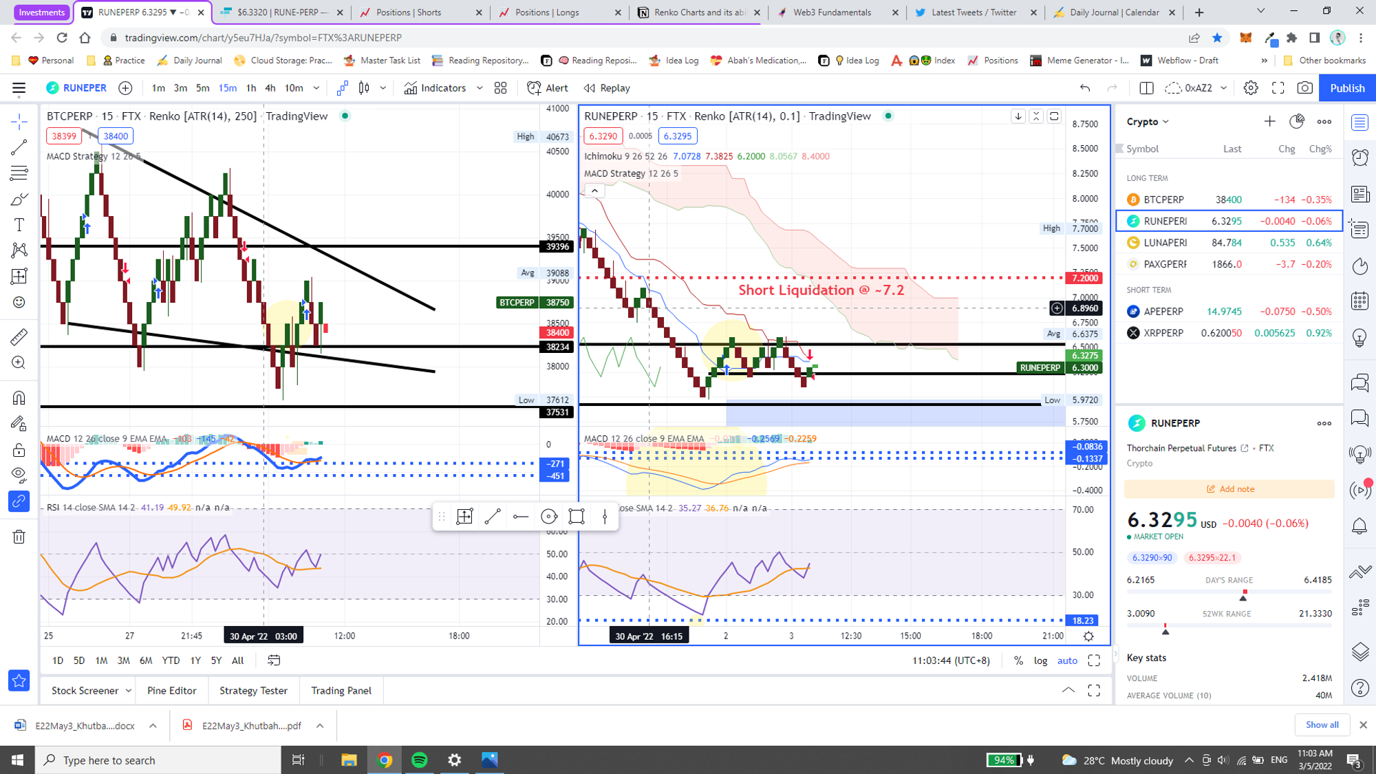
Honestly seems to be like this is just bad speculation, since BTC and RUNE indicators are at odds, pretty much. But okay, it is indeed a live test so shall see how it goes.
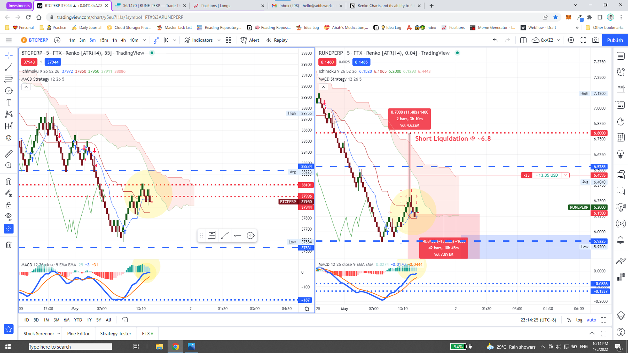
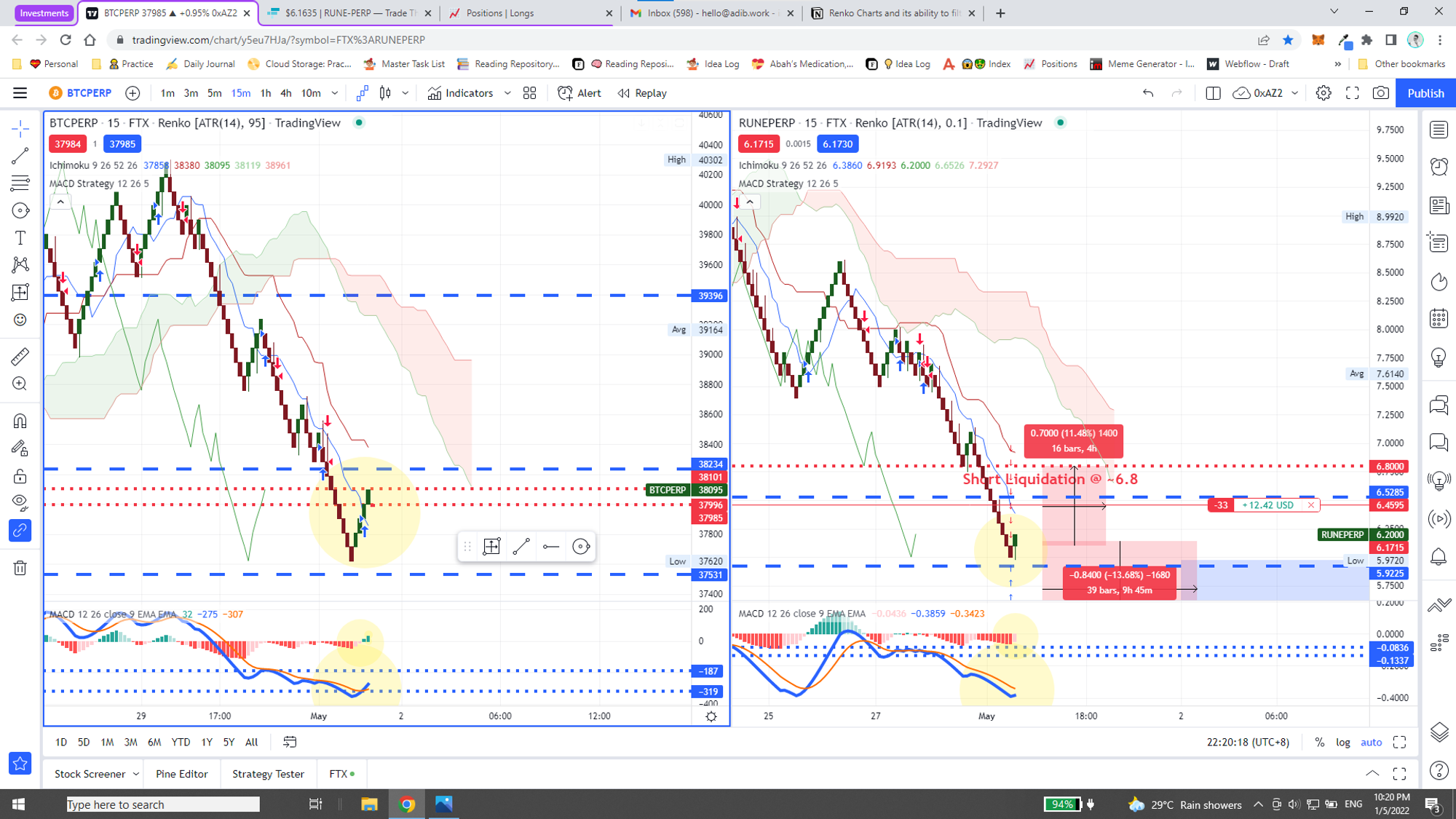
But just a thought, what if Renko is used for BTC, while a normal chart is used for the paired asset, i.e. RUNE in this case?
📉 | Entry | 6.33 | Exit | |
BTC | RUNE | |||
1 | Renko | Red | ||
2 | Candlestick | Down | Down | |
3 | MACD Strategy | Up | Down | |
4.1 | MACD Indicator | Histogram | Light Green | Light Green |
4.2 | MACD Indicator | MACD Line | Moving Down | Moving Down |
5 | RSI | Down | Moving Down |
15 Minutes 🐂
Takeaway
- Deciding to use Timeframe vs Traditional for Box Size
- Deciding box size for Timeframe
- Deciding box size for Traditional
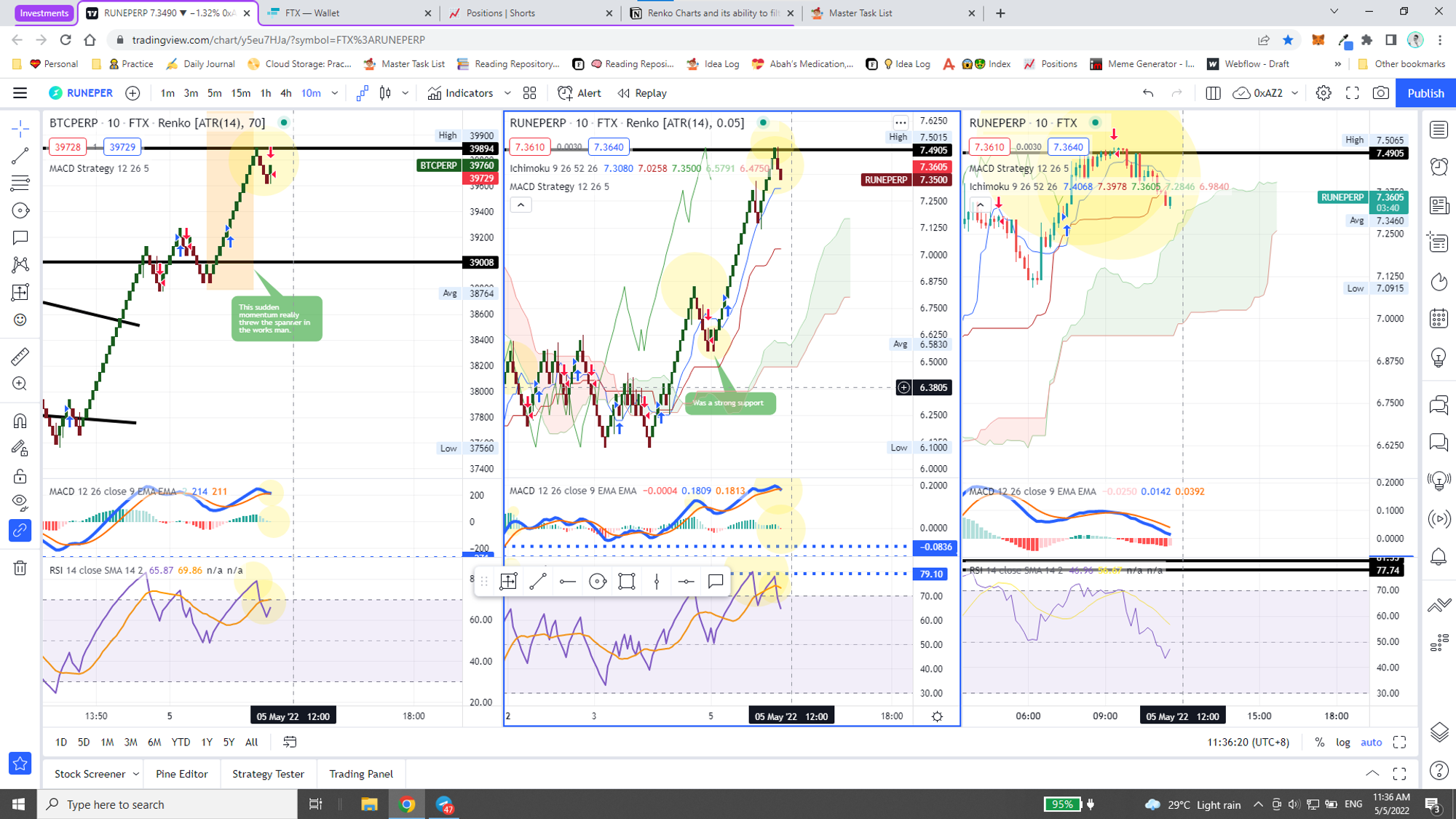
@May 3, 2022
15 Minutes 🐂
@May 3, 2022 11:13 AM (GMT+8)
📈 | 🟢 Entry | 🟢 6.29 | 🔴 Exit | 🔴 |
BTC | RUNE | |||
1 | Renko | Red | Green | |
2 | MACD Strategy | Up | Up | |
3.1 | MACD Indicator | Histogram | Green | Green |
3.2 | MACD Indicator | MACD Line | Up | Up |
4 | RSI | Up | Up |
@May 3, 2022 11:56 AM (GMT+8)
📈 | 🟢 Entry | 🟢 6.29 | 🔴 Exit | 🔴 |
BTC | RUNE | |||
1 | Renko | Turning Red | Green | |
2 | MACD Strategy | Up | Down | |
3.1 | MACD Indicator | Histogram | Green | Green |
3.2 | MACD Indicator | MACD Line | Up | Up |
4 | RSI | Up | Up |
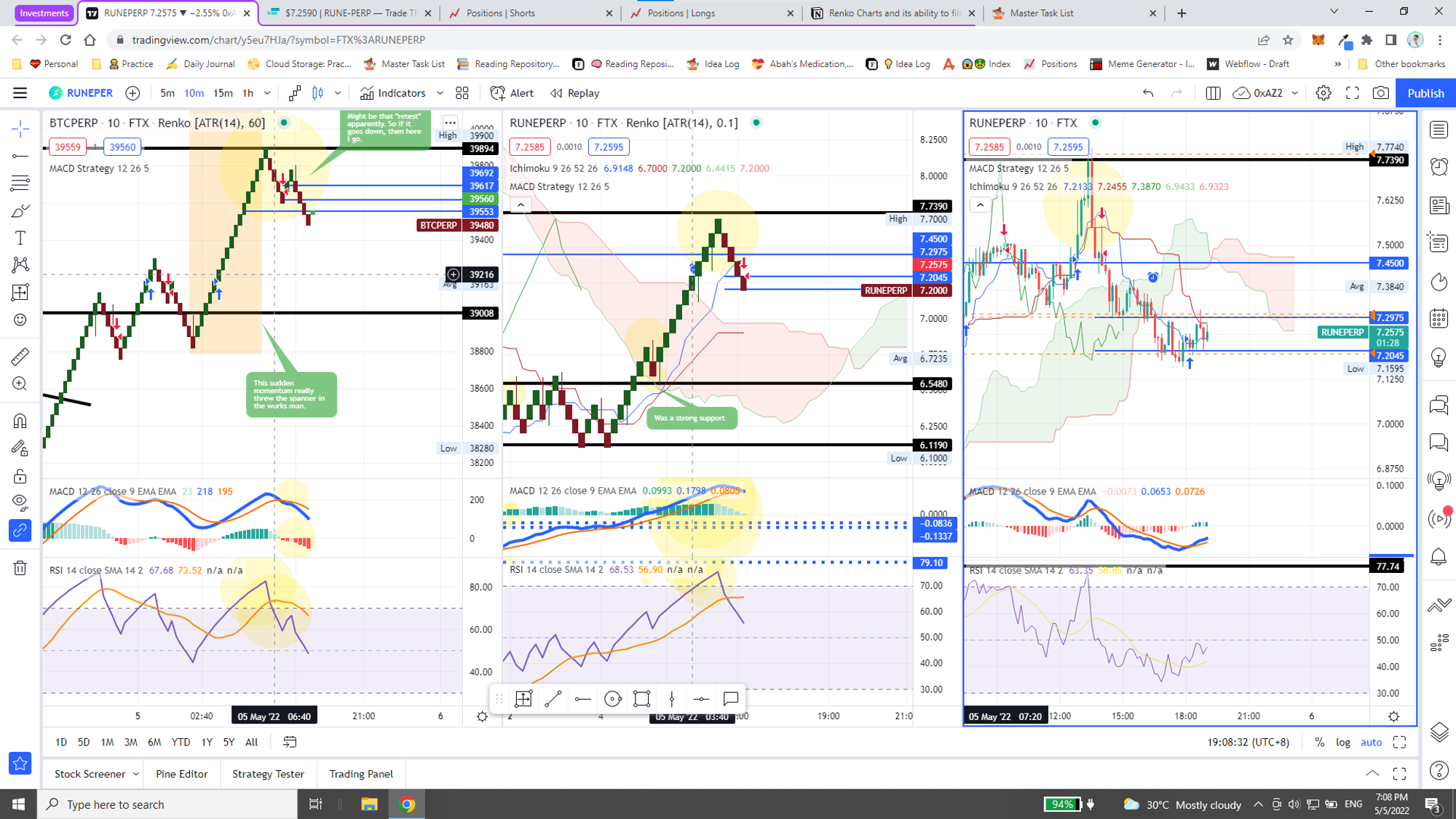
@May 3, 2022 9:47 PM (GMT+8)
Okay, pretty much exited the “6.29” position because nothing much changed HAHA. Okay it did, but I wasn’t present to capitalize on that shift.
15 Minutes 🐻
Time | BTC | RUNE |
10:16 PM | ~38,180 | ~6.29 |
Time | BTC | RUNE |
3:30 AM | ~37,500 | ~6.1 |
Probability Validity |
🟢 |
@May 4, 2022
15 Minutes 🟢
📈 | 🟢 Entry | 🟢 6.29 | 🔴 Exit | 🔴 |
BTC | RUNE | |||
1 | Renko | Turning Green | Green | |
2 | MACD Strategy | Down | Down | |
3.1 | MACD Indicator | Histogram | Red | Light Red |
3.2 | MACD Indicator | MACD Line | Down | Up |
4 | RSI | Down | Up |
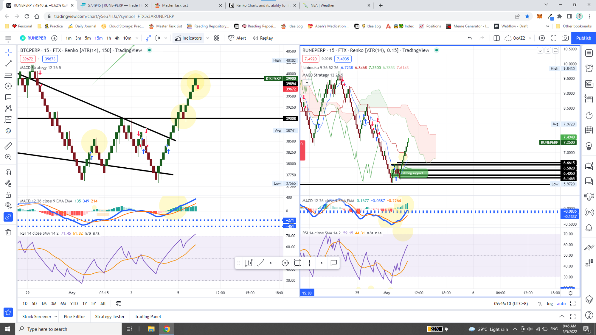
@May 5, 2022
10 Minutes 🔴
🟢 Entry | 🟢 7.44 | 🔴 Exit | 🔴 | |
BTC | RUNE | |||
1 | Renko | Green (+1) | Red (-1) | |
2 | MACD Strategy | Down (-1) | ||
3.1 | MACD Indicator | Histogram | Light Green (+1) | Red (-1) |
3.2 | MACD Indicator | MACD Line | Down (-1) | Down (-1) |
4 | RSI | Down (-1) | Down (-1) |
🟢 Entry | 🟢 7.44 | 🔴 Exit | 🔴 | |
BTC | RUNE | |||
1 | Renko | Red (-1) | Red (-1) | |
2 | MACD Strategy | Down (-1) | Down (-1) | |
3.1 | MACD Indicator | Histogram | Red (-1) | Light Green (+1) |
3.2 | MACD Indicator | MACD Line | Down (-1) | Going Down (-1) |
4 | RSI | Down (-1) | Down (-1) |
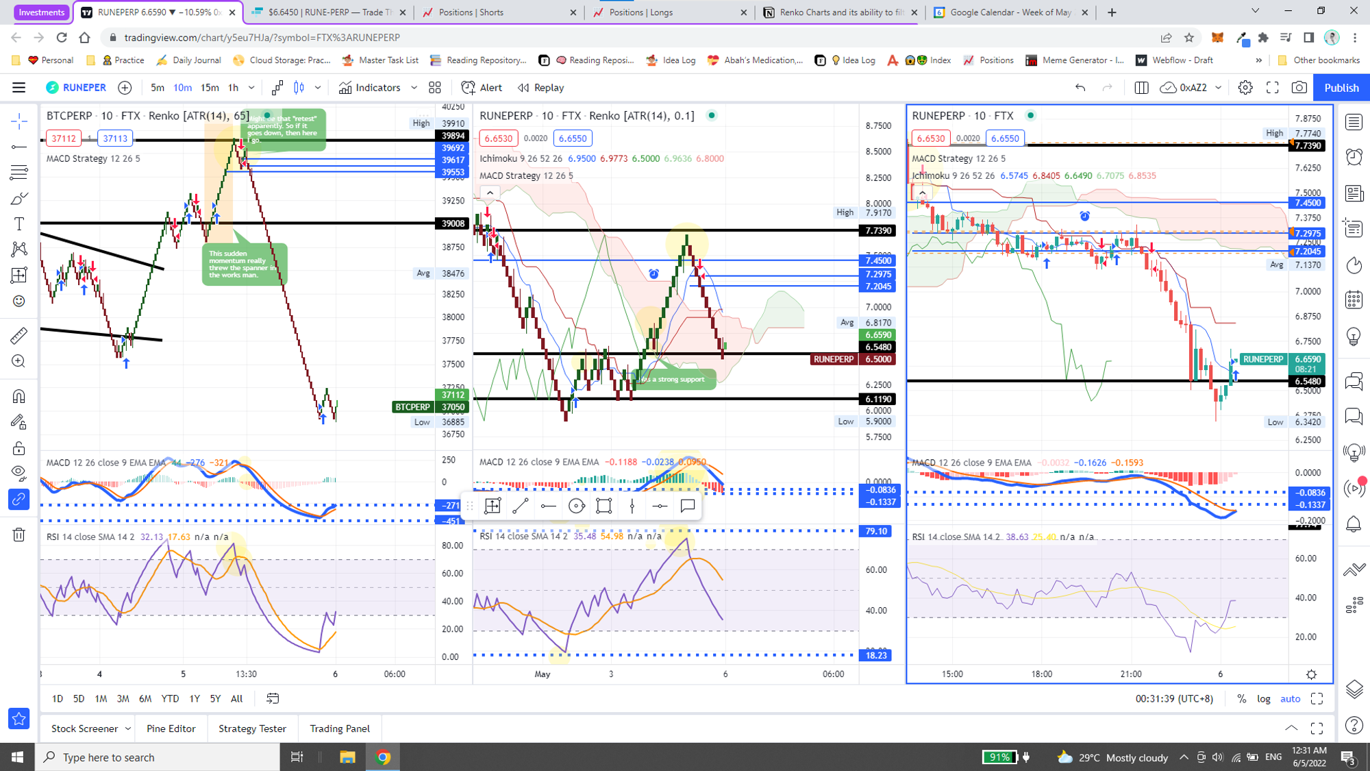
@May 6, 2022
10 Minutes 🟢
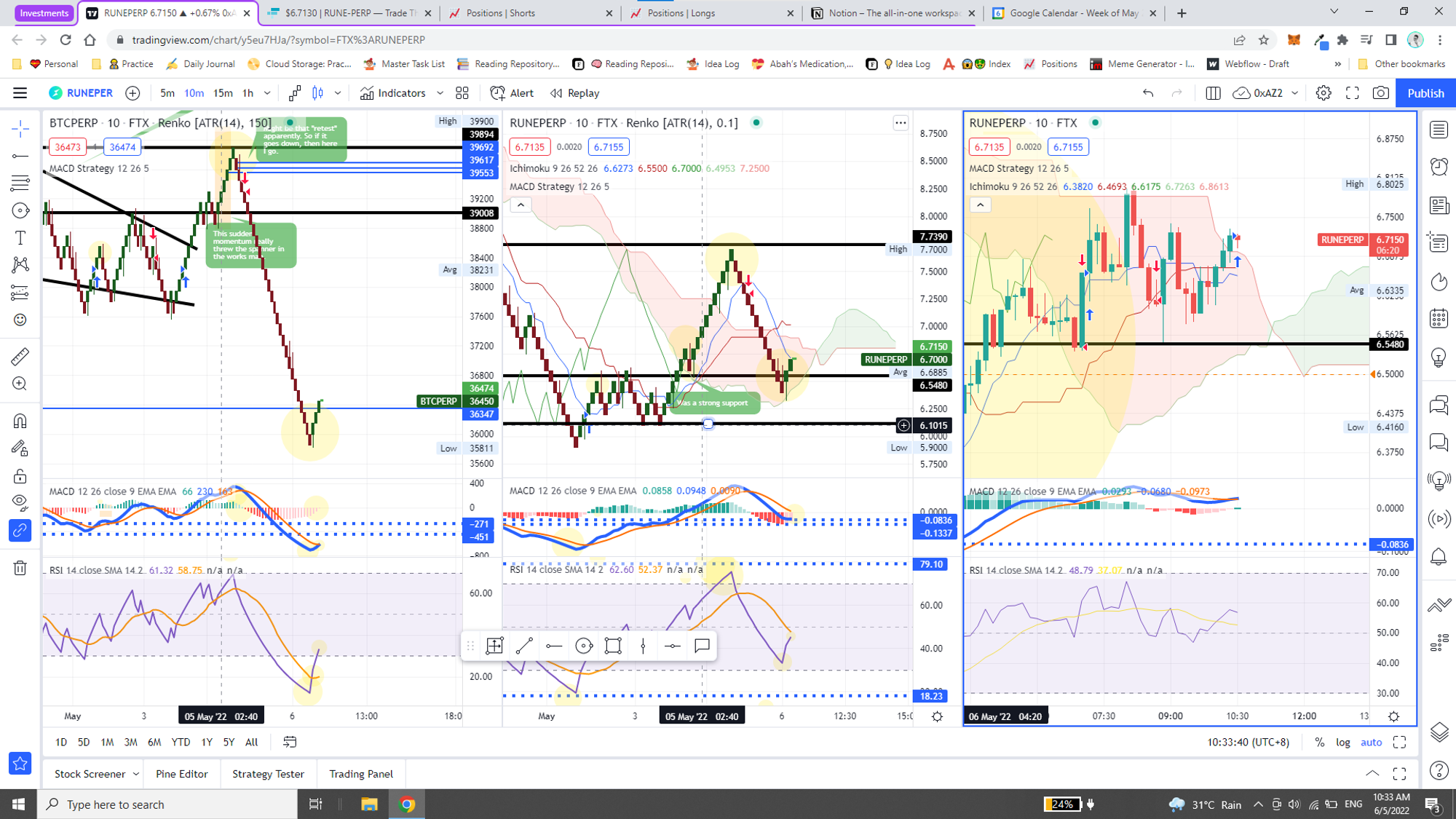
BTC | RUNE | |||
1 | Renko | Green | Green | |
2 | MACD Strategy | |||
3.1 | MACD Indicator | Histogram | Light Red | Light Red |
3.2 | MACD Indicator | MACD Line | Up | Going Up |
4.1 | RSI | State | Oversold | |
4.2 | RSI | Line | Up | Up |
Honestly, what have I learned though? That the Renko chart really works and that I just need to have better position management — i.e. 50% ability to offset volatility. Because it surely will go in the direction that was dictated by the Renko!